← Home
ARISE

Project
APP Design & Branding
Timeline
1 Month
Tools
Figma
Overview
Augmented Reality Integrated Sensorimotor Training and Exercise

ARISE is a smart wellness system built by ARST, aimed at supporting neck-pain care through immersive augmented reality and AI-driven personalization.
Whether in clinic or at home, the app empowers users and clinicians to tackle neck mobility, posture, coordination, and recovery in an engaging, accessible way.
Problem
Why ARISE Needed to Exist

Neck pain and reduced mobility are pervasive issues, especially among people with sedentary lifestyles or chronic strain. Traditional rehab systems often feel clinical, repetitive, and low on user engagement. Key challenges included:

Lack of motivating, immersive training experiences for neck-care.

Poor engagement and retention when patients train at home.

Need for systems that can adapt to individual ability levels in real time.
Most rehab tools aren’t built for real-world recovery.
Most neck-care and mobility tools feel clinical, repetitive, or difficult to stay consistent with. Many patients stop using them because the sessions are boring, the feedback isn’t clear, or the exercises don’t adapt to their changing pain levels.
Clinicians also struggle to monitor progress outside the clinic, leading to gaps in care and low patient adherence.
The lack of an engaging, adaptive, and easy-to-use system makes recovery harder, slower, and less motivating.
Say hello to ARISE!
Solution
A guided, intelligent system for restoring healthy movement.
ARISE provides a structured, clinician-supported space for neck rehabilitation. The app brings together assessment, training, monitoring, and customization into one seamless workflow.

Set personalized training plans and track progress with clarity


Process
Flexible components built for clinical workflows
Designing ARISE required balancing clarity, medical accuracy, and ease of use. Because both clinicians and patients interact with the app, every screen needed to feel intuitive, structured, and consistent.
I focused on building modular, reusable components that could accommodate different session steps — from searching patients, entering diagnosis details, configuring training settings, to monitoring real-time performance. This approach made the experience predictable across screens and reduced cognitive load during clinical workflows where speed and precision matter.
Using a consistent visual system allowed the app to scale easily as new assessments, metrics, or session types are added in future versions.
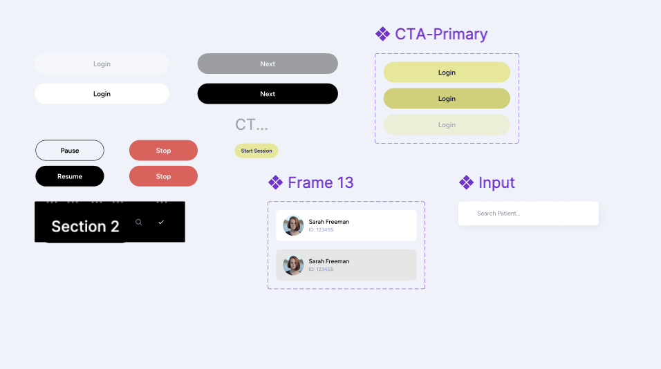
Each UI component was designed with adaptability in mind — sliders, input fields, session cards, patient lists, and configuration modules could all adjust based on the session stage.
This made it possible to support a wide range of tasks:
- entering ROM, pain, and smoothness scores
- adjusting movement settings like amplitude, speed, or jitter
- reviewing session summaries and past results
- configuring multi-step training flows
By keeping components modular and consistent, clinicians can move through sessions quickly without needing to relearn controls on every screen.


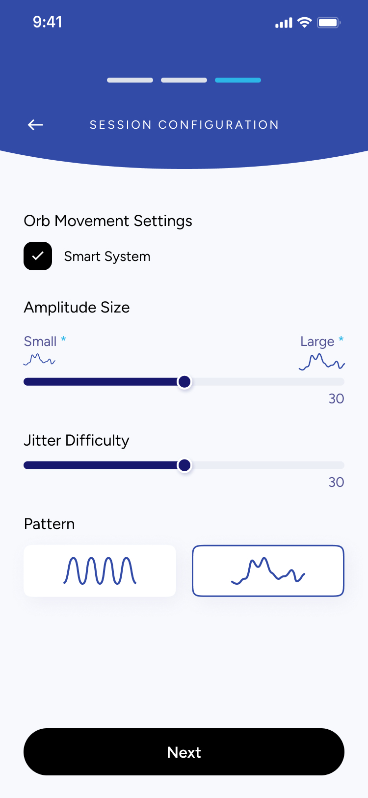
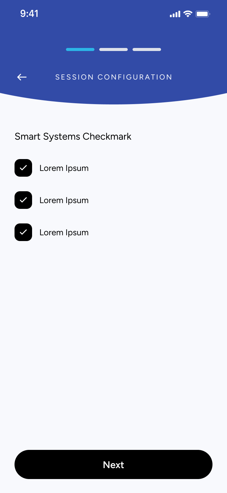
SESSION CONFIGURATION
Orb Movement Settings

Smart System
Amplitude Size
Small *

Large *

30
Jitter Difficulty
30
Pattern


Next
Understanding the problem
What I Found
- Clinicians lack a unified system: Many physiotherapists and specialists don’t have a streamlined digital tool to assess neck mobility, record ROM results, or manage session data in one place
- Inconsistent progress tracking: Without clear visual feedback or historical data, it’s difficult for both patients and clinicians to understand progress across sessions.
- Session setup is time-consuming: Configuring training settings (like amplitude, speed, jitter, or movement direction) often requires manual steps or external tools, which slows down appointments.
- Patients struggle with motivation: Without visible performance insights or structured routines, patients may feel unsure whether they are improving, affecting consistency in their rehabilitation.
Key Questions to Consider
Before moving forward, I needed to answer some key questions:
- Am I solving the right clinical workflow problem?
- Who will use the app? (Physiotherapists, chiropractors, occupational therapists, and patients undergoing neck mobility rehabilitation)
- Why is an app the best solution? (It digitizes assessment, improves accuracy, speeds up setup, and provides visual progress tracking)
- What core features are needed for a strong first version?
User Persona
Who is this app targetting?
Name
Clinician / Patient
Age
25–55
Occupation
Physiotherapist, Chiropractor, or Rehab Patient
Frustrations
- Time-consuming manual assessments
- No centralized place to store session data
- Hard to understand patient progress over time
- Inconsistent home exercises due to unclear instructions
Background
Many clinicians rely on manual assessments and paper notes to track neck mobility, which leads to inconsistency and lost data. Patients often receive basic instructions but lack a structured, guided way to improve between sessions.
Interests
- Improving patient outcomes
- Using reliable, professional digital tools
- Tracking progress with accurate metrics (ROM, smoothness, pain levels)
- Integrating technology into daily clinical workflows
Goals
- Perform fast, accurate mobility diagnostics
- Configure sessions quickly with preset and custom settings
- Give patients clear, trackable performance insights
- Reduce administrative work and focus more on care
Secondary Research
After undergoing some research and communicating with the client, three key points stood out:
✅ Clinicians want something easy to use: A simple, intuitive tool that reduces setup time and minimizes manual documentation is essential.✅ Tracking accuracy matters: Objective measurements — range of motion, movement quality, and session data — help clinicians make better decisions and improve treatment plans.✅ Personalization is key: Every patient’s condition is different, so clinicians need flexibility to adjust session settings and tailor assessments.
- By identifying these challenges, I designed Arise as a clean, efficient tool that helps clinicians run accurate assessments and provide patients with clear, trackable progress.
Low Fidelity Wireframes
Before diving into detailed design, I started with low-fidelity wireframes to quickly map out the user journey and screen layouts. These rough sketches allowed me to focus purely on functionality and user flow, without getting caught up in visuals or styling.


Results
A Clinical Tool Designed for Clarity & Efficiency
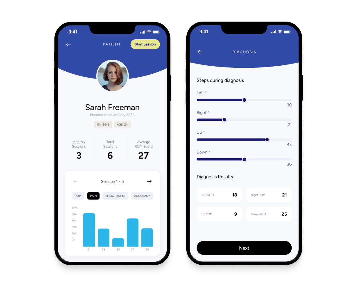
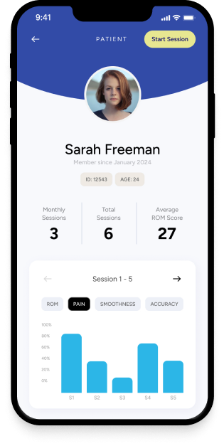
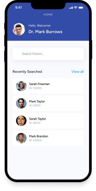
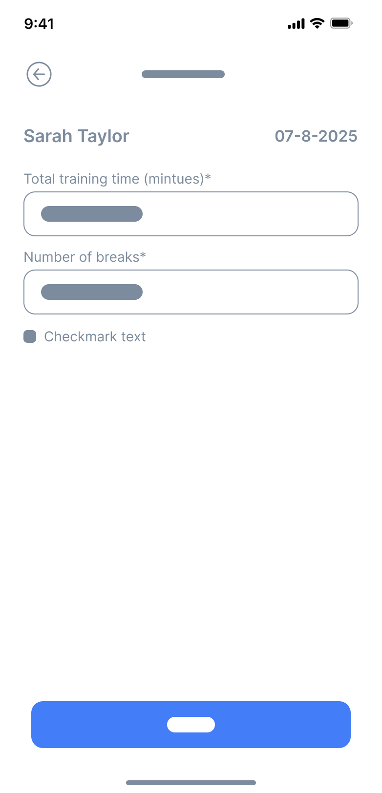
The final design centered on creating a clean, clinician-friendly experience that makes patient management intuitive and fast. From searching patients to running real-time performance sessions, every screen was crafted to reduce friction, support accuracy, and guide clinicians step-by-step through each session.
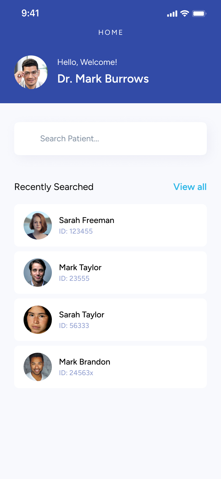
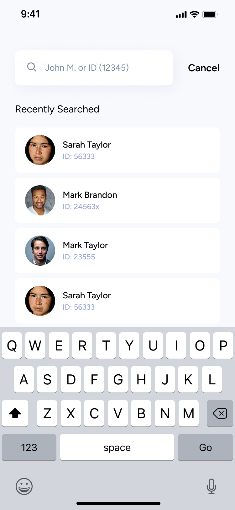
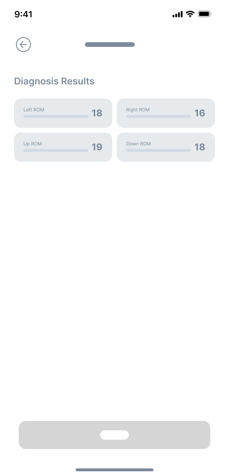
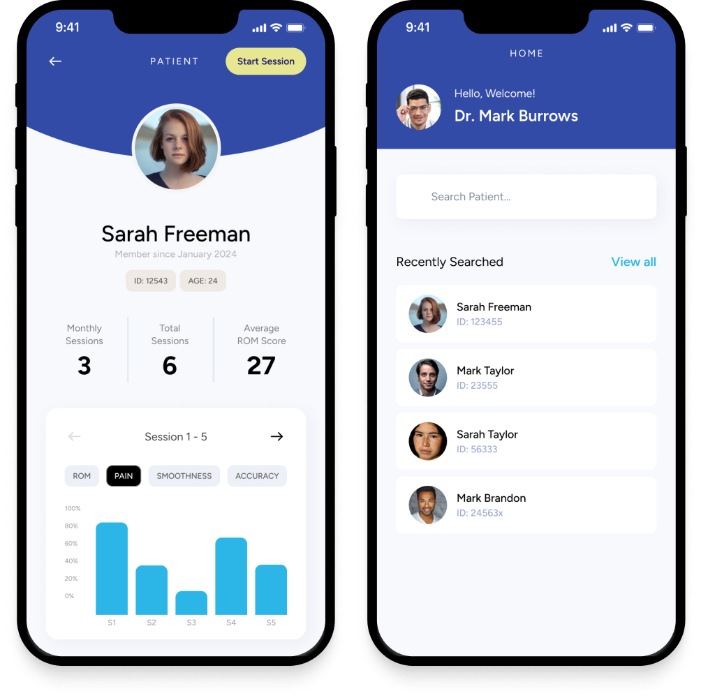
Track and manage patient sessions
- View all previous sessions at a glance.
- Quickly scan diagnosis results with clean, comparable metrics.
- Search and access patient profiles in seconds.

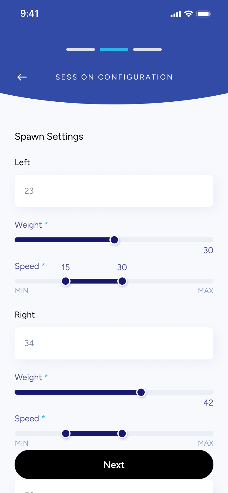
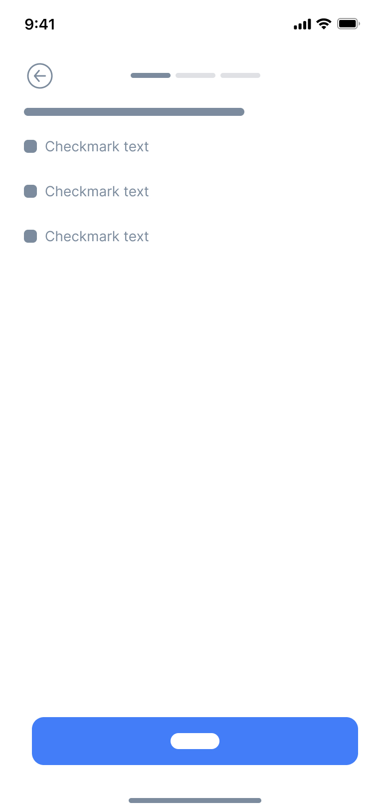
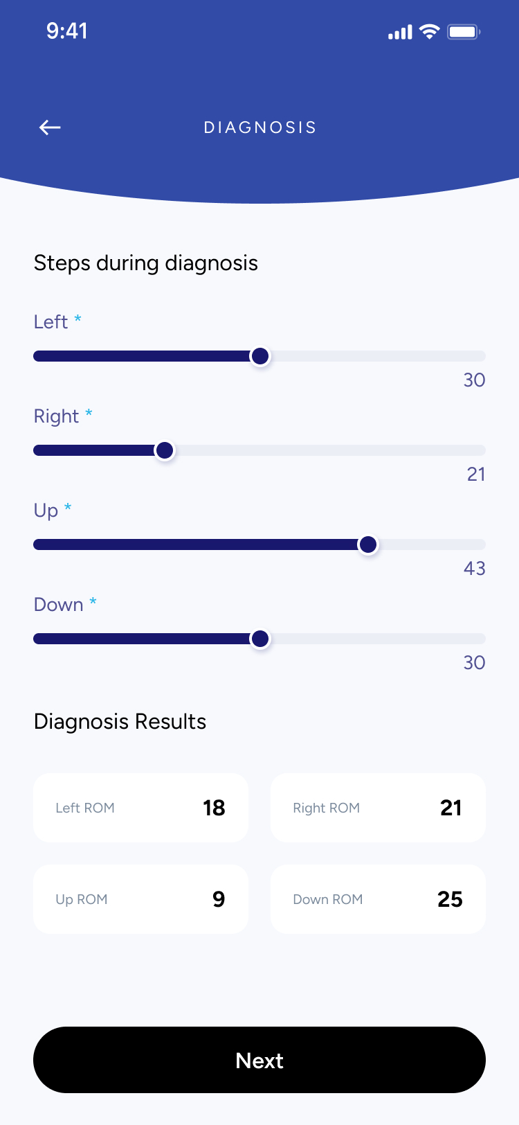
Configure sessions with precision


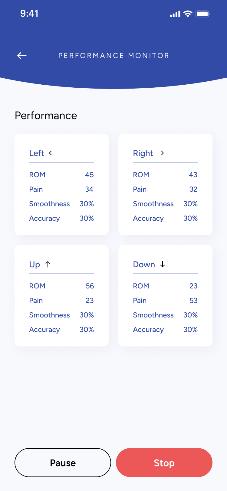
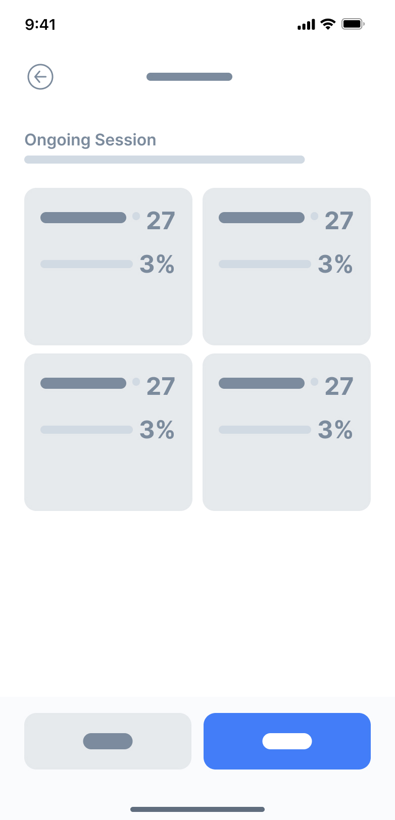
Monitor performance in real time
- Live metrics update as patients move through the session.
- Clinicians can pause or stop at any moment for safety.
- High-contrast data cards make quick evaluations effortless.

Reflection
Designing for Clinical Precision & Ease of Use
Building an app for clinicians meant designing with accuracy, clarity, and reliability in mind. Every screen needed to feel professional and distraction-free. It was important that the interface supported fast decision-making while remaining approachable for both new and experienced practitioners.
Micro-Interactions Made the Difference
Small interaction details—like slider feedback, smooth transitions between session steps, and clean state changes—played a huge role. These subtle cues helped clinicians confirm inputs at a glance and stay oriented throughout multi-step workflows. It showed me how thoughtful micro-interactions can make complex medical tasks feel simple and fluid.
Prototyping in Figma Opened Up New Ideas
Using Figma prototypes allowed me to test long, structured flows like diagnosis → configuration → performance monitoring without writing code. I could quickly refine steps, improve clarity, and validate the order of inputs with stakeholders. This reinforced the value of rapid iteration for complex systems, helping me shape a more intuitive and efficient clinical experience.
← Home
ARISE

Project
APP Design & Branding
Timeline
1 Month
Tools
Figma
Overview
Augmented Reality Integrated Sensorimotor Training and Exercise

ARISE is a smart wellness system built by ARST, aimed at supporting neck-pain care through immersive augmented reality and AI-driven personalization.
Whether in clinic or at home, the app empowers users and clinicians to tackle neck mobility, posture, coordination, and recovery in an engaging, accessible way.
Problem
Why ARISE Needed to Exist
Neck pain and reduced mobility are pervasive issues, especially among people with sedentary lifestyles or chronic strain. Traditional rehab systems often feel clinical, repetitive, and low on user engagement. Key challenges included:
Lack of motivating, immersive training experiences for neck-care.
Poor engagement and retention when patients train at home.
Need for systems that can adapt to individual ability levels in real time.
Most rehab tools aren’t built for real-world recovery.
Most neck-care and mobility tools feel clinical, repetitive, or difficult to stay consistent with. Many patients stop using them because the sessions are boring, the feedback isn’t clear, or the exercises don’t adapt to their changing pain levels.
Clinicians also struggle to monitor progress outside the clinic, leading to gaps in care and low patient adherence.
The lack of an engaging, adaptive, and easy-to-use system makes recovery harder, slower, and less motivating.
Say hello to ARISE!
Solution
A guided, intelligent system for restoring healthy movement.

ARISE provides a structured, clinician-supported space for neck rehabilitation. The app brings together assessment, training, monitoring, and customization into one seamless workflow.

Set personalized training plans and track progress with clarity
Process
Flexible components built for clinical workflows
Designing ARISE required balancing clarity, medical accuracy, and ease of use. Because both clinicians and patients interact with the app, every screen needed to feel intuitive, structured, and consistent.
I focused on building modular, reusable components that could accommodate different session steps — from searching patients, entering diagnosis details, configuring training settings, to monitoring real-time performance. This approach made the experience predictable across screens and reduced cognitive load during clinical workflows where speed and precision matter.
Using a consistent visual system allowed the app to scale easily as new assessments, metrics, or session types are added in future versions.
Each UI component was designed with adaptability in mind — sliders, input fields, session cards, patient lists, and configuration modules could all adjust based on the session stage.
This made it possible to support a wide range of tasks:
- entering ROM, pain, and smoothness scores
- adjusting movement settings like amplitude, speed, or jitter
- reviewing session summaries and past results
- configuring multi-step training flows
By keeping components modular and consistent, clinicians can move through sessions quickly without needing to relearn controls on every screen.
SESSION CONFIGURATION
Orb Movement Settings
Smart System
Amplitude Size
Small *
Large *
30
Jitter Difficulty
30
Pattern
Next
Understanding the problem
What I Found
- Clinicians lack a unified system: Many physiotherapists and specialists don’t have a streamlined digital tool to assess neck mobility, record ROM results, or manage session data in one place
- Inconsistent progress tracking: Without clear visual feedback or historical data, it’s difficult for both patients and clinicians to understand progress across sessions.
- Session setup is time-consuming: Configuring training settings (like amplitude, speed, jitter, or movement direction) often requires manual steps or external tools, which slows down appointments.
- Patients struggle with motivation: Without visible performance insights or structured routines, patients may feel unsure whether they are improving, affecting consistency in their rehabilitation.
Key Questions to Consider
Before moving forward, I needed to answer some key questions:
- Am I solving the right clinical workflow problem?
- Who will use the app? (Physiotherapists, chiropractors, occupational therapists, and patients undergoing neck mobility rehabilitation)
- Why is an app the best solution? (It digitizes assessment, improves accuracy, speeds up setup, and provides visual progress tracking)
- What core features are needed for a strong first version?
User Persona
Who is this app targetting?
Name
Clinician / Patient
Age
25–55
Occupation
Physiotherapist, Chiropractor, or Rehab Patient
Frustrations
- Time-consuming manual assessments
- No centralized place to store session data
- Hard to understand patient progress over time
- Inconsistent home exercises due to unclear instructions
Background
Many clinicians rely on manual assessments and paper notes to track neck mobility, which leads to inconsistency and lost data. Patients often receive basic instructions but lack a structured, guided way to improve between sessions.
Interests
- Improving patient outcomes
- Using reliable, professional digital tools
- Tracking progress with accurate metrics (ROM, smoothness, pain levels)
- Integrating technology into daily clinical workflows
Goals
- Perform fast, accurate mobility diagnostics
- Configure sessions quickly with preset and custom settings
- Give patients clear, trackable performance insights
- Reduce administrative work and focus more on care
Secondary Research
After undergoing some research and communicating with the client, three key points stood out:
✅ Clinicians want something easy to use: A simple, intuitive tool that reduces setup time and minimizes manual documentation is essential.✅ Tracking accuracy matters: Objective measurements — range of motion, movement quality, and session data — help clinicians make better decisions and improve treatment plans.✅ Personalization is key: Every patient’s condition is different, so clinicians need flexibility to adjust session settings and tailor assessments.
- By identifying these challenges, I designed Arise as a clean, efficient tool that helps clinicians run accurate assessments and provide patients with clear, trackable progress.
Low Fidelity Wireframes
Before diving into detailed design, I started with low-fidelity wireframes to quickly map out the user journey and screen layouts. These rough sketches allowed me to focus purely on functionality and user flow, without getting caught up in visuals or styling.
Results
A Clinical Tool Designed for Clarity & Efficiency
The final design centered on creating a clean, clinician-friendly experience that makes patient management intuitive and fast. From searching patients to running real-time performance sessions, every screen was crafted to reduce friction, support accuracy, and guide clinicians step-by-step through each session.
Track and manage patient sessions
- View all previous sessions at a glance.
- Quickly scan diagnosis results with clean, comparable metrics.
- Search and access patient profiles in seconds.
Configure sessions with precision
Monitor performance in real time
- Live metrics update as patients move through the session.
- Clinicians can pause or stop at any moment for safety.
- High-contrast data cards make quick evaluations effortless.

Reflection
Designing for Clinical Precision & Ease of Use
Building an app for clinicians meant designing with accuracy, clarity, and reliability in mind. Every screen needed to feel professional and distraction-free. It was important that the interface supported fast decision-making while remaining approachable for both new and experienced practitioners.
Micro-Interactions Made the Difference
Small interaction details—like slider feedback, smooth transitions between session steps, and clean state changes—played a huge role. These subtle cues helped clinicians confirm inputs at a glance and stay oriented throughout multi-step workflows. It showed me how thoughtful micro-interactions can make complex medical tasks feel simple and fluid.
Prototyping in Figma Opened Up New Ideas
Using Figma prototypes allowed me to test long, structured flows like diagnosis → configuration → performance monitoring without writing code. I could quickly refine steps, improve clarity, and validate the order of inputs with stakeholders. This reinforced the value of rapid iteration for complex systems, helping me shape a more intuitive and efficient clinical experience.