
M
Home
J
Home


MY WORK
Email Designs
I approach email design as a balance of visual hierarchy, messaging, and user behavior, making sure each send feels intentional, on-brand, and easy to act on.

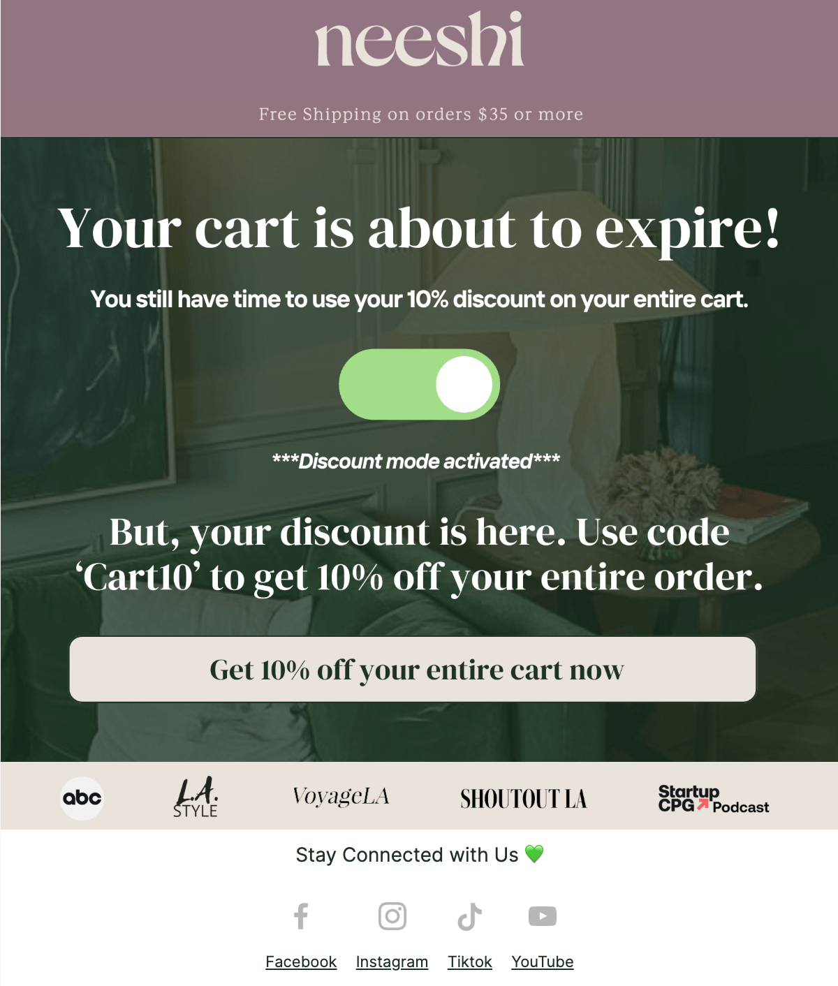
Neeshi
I helped Neeshi improve their email design by refining visual hierarchy, strengthening calls to action, and creating a more consistent brand presence across campaigns. The goal was to make emails easier to scan, more engaging on mobile, and better aligned with e-commerce best practices — resulting in clearer messaging and stronger conversion intent.
BEFORE
AFTER


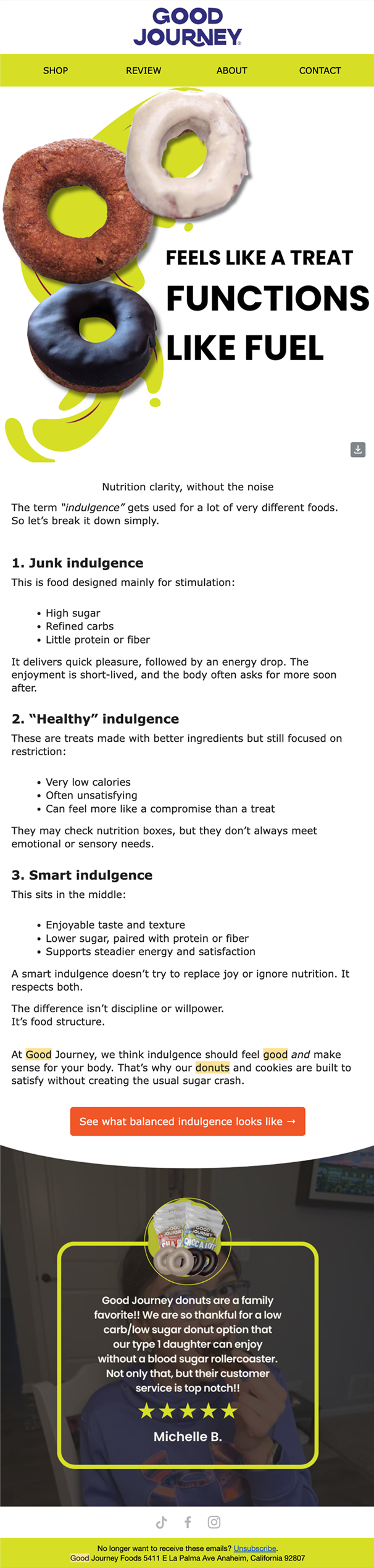
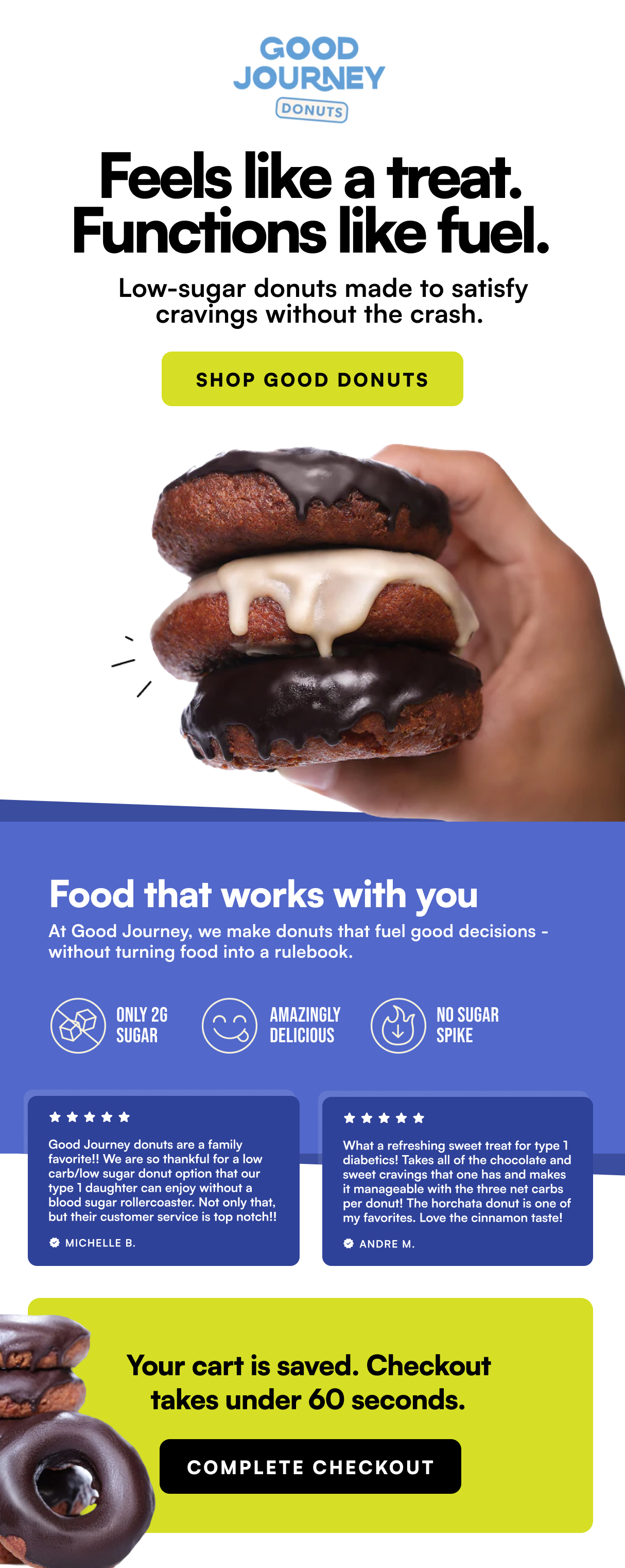
Good Journey Donuts
I redesigned Good Journey’s email to improve clarity and scannability by breaking dense content into visually distinct sections. The updated layout helps customers quickly understand the product benefits, builds trust through social proof, and drives action without requiring a full read.
BEFORE
AFTER
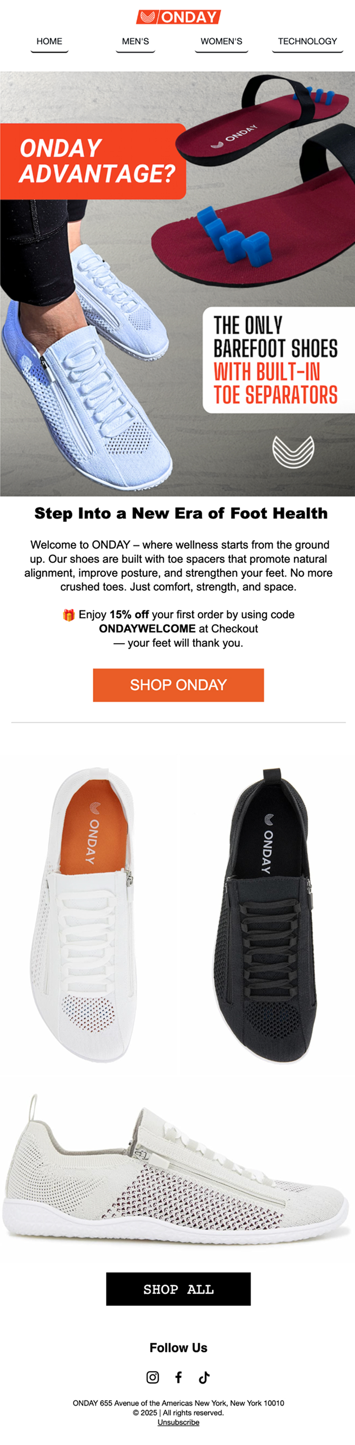
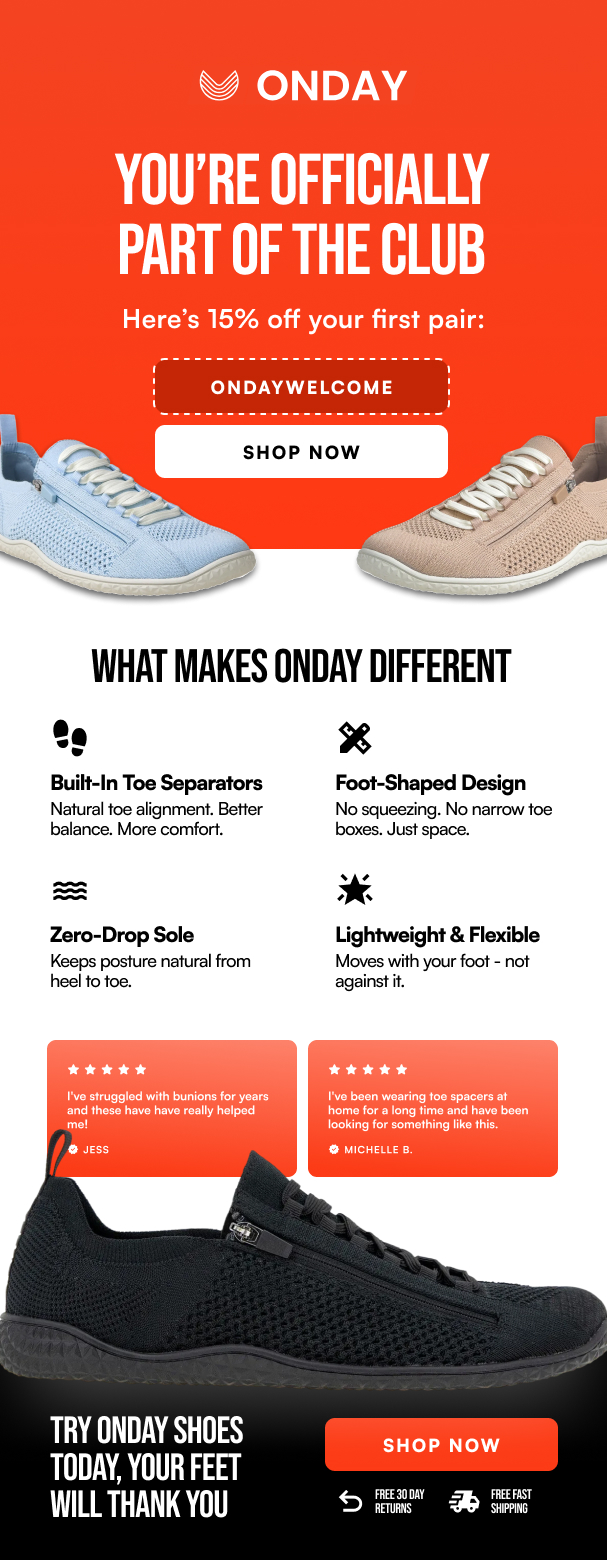
ONDAY Shoes
ONDAY’s email had to be simplified to market a complex product concept into a scannable, benefit-driven layout. The updated design uses clear hierarchy and visual structure to explain what makes the shoes different and guide customers toward purchase.
BEFORE
AFTER
J
Home

MY WORK
Email Designs
I approach email design as a balance of visual hierarchy, messaging, and user behavior, making sure each send feels intentional, on-brand, and easy to act on.

Neeshi
BEFORE
AFTER

Good Journey Donuts
I redesigned Good Journey’s email to improve clarity and scannability by breaking dense content into visually distinct sections. The updated layout helps customers quickly understand the product benefits, builds trust through social proof, and drives action without requiring a full read.
BEFORE
AFTER
Good Journey Donuts
I redesigned Good Journey’s email to improve clarity and scannability by breaking dense content into visually distinct sections. The updated layout helps customers quickly understand the product benefits, builds trust through social proof, and drives action without requiring a full read.
ONDAY Shoes
ONDAY’s email had to be simplified to market a complex product concept into a scannable, benefit-driven layout. The updated design uses clear hierarchy and visual structure to explain what makes the shoes different and guide customers toward purchase.
BEFORE
AFTER